
CANVAS
REDESIGN
CLASS
Designing Interactive Systems
ASSIGNMENT
Website redesign: create a tablet version of Canvas.
Design 4+ screens that showcase your exploration.
Optional: create two new features + digital mockups.
PROBLEM STATEMENT

Canvas is a necessary tool for users; both students and professors require frequent use of basic Canvas functionality in order to assign, organize, and orchestrate assignments, grades, and other academic resources.
Yet the current Canvas design is a total mess.
Nearly all ten of Nielsen's Heuristics are broken, there are eight (potentially important!) messages in the inbox pictured, yet no one is likely to notice when the notifications are so small and hidden away in the corner, and using check plus icons for items that have not yet been completely makes absolutely no sense.
Listing all of the problems with the current Canvas UI would take hours, so for the purpose of this assignment I'll focus on the most crucial factors I addressed while modifying for tablet use: ( 1 ) a decrease in screen surface area, requiring a reorganization of content hierarchy, and ( 2 ) switching from mouse-controlled to touch interface, thus requiring much larger buttons than the current design.
USER TESTING

PROCESS
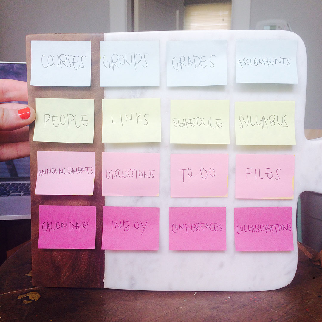
Due to time and other resource constraints, and most especially due to a very recent move and thus still living out of boxes, I had to get a bit crafty with my research testing.
I used a partially marble, partially wood cutting board as a drafting surface, and small post-it notes for cards. I wrote down each of the current Canvas elements on post-its, and laid them out in no particular order on one stool, placed the cutting board on a second stool, and placed both in front of my participant. I asked him to place the post-its in a hierarchy of needs, thinking out loud as he worked to explain what functionalities he believed would be included with each element, and why he felt it was or was not important.
PARTICIPANT
Nicholas Rawitsch
Male, 23 Years Old
Native Los Angeleno
Non-User of Canvas
METHOD
I chose the card sort activity to test a non-user. My thinking was that someone without preconceived ideas of how Canvas currently works might help reveal a better mental model, flow, and map of Canvas content. I thought it might help create a better content hierarchy, thus leading to a better and more concise menu, navigation, and content structure for the tablet redesign.

PERSONAS
Jenny Z
28 Years Old
MFA Student // Teacher’s Assistant
Likes Woody Allen, Surrealism, Watercolor, Sophie (pictured)
CANVAS GOALS
1. Submit assignments
2. Grade student assignments
3. Communicate with Professor
Preferred Communication:
Email >> Canvas Chat
Professor K
70 Years Old
Tenured Professor of Literary Studies
Likes Writing Mystery Novels, Golf, Good Wine, His Wife Margo
CANVAS GOALS
1. Post/update Syllabi
2. Communicate with TA
3. Post course announcements
Preferred Communication:
Email >> Canvas Messaging
Maddie G
19 Years Old
Sophomore Undergrad in Neuroscience
Likes French Bulldogs, Brains, Math, Hip Hop, Parties, Friends
CANVAS GOALS
1. Submit assignments
2. View grades
3. View upcoming exams + assignments
Preferred Communication:
Texting >> Canvas Chat >> Email
HOME SCREEN REDESIGN
Designing with my personas in mind, and taking into account all that I learned during the card sort, the first iteration of my redesigned home screen is shown below. Instead of keeping the current design of bundling up recent activity, so that additional clicks must occur for a user to access any actual information, I decided to use a news feed for my home screen, with optional class filters. My reasoning was that users accessing Canvas want immediate access to the most recent and pertinent information; they want to know what they have to do next or what has just been done, and they want to get in and out of Canvas quickly and efficiently.
FEEDBACK
A few rounds of usability testing provided me with some valuable insights: (1) the hamburger menu was confusing. It did not indicate a filter menu, and instead implied a second global menu and (2) the newsfeed content was hard to make sense of holistically; distinguishing categorical information for each item was cognitively taxing on the user.
FIXES
(1) To address hamburger menu confusion, I changed the icon to one indicating dropdown functionality. (2) In order to make categorization of related course easier on the user, I moved course info to the front of each listed item, and bolded course or professor for easier categorization.
FEEDBACK
After some additional usability testing, I learned the following: (1) my icons were too confusing and ambiguous to easily understand (2) people naturally wanted to tap the Canvas icon in the top right of the screen to return home; the newsfeed icon, buried in the middle of the menu, was a major fail, and (3) there truly is no need to have separate pages and icons for inbox (pictured on the right) and chat; the two functions can and should be combined into one.
FIXES
To address the above issues, I changed the Canvas icon function to return the user home, added a new icon for the quiz (previously the function of the Canvas icon, now the brain/lightning icon), and combined chat and inbox into one.

NEW FEATURE --
INTERACTIVE QUIZ
NEW FEATURE --
REAL-TIME MESSAGING
NEXT STEPS
With additional time to work on the project, the first thing I would do is create a better archival system within messaging; I would love to design a more robust, collaborative tool for Canvas.